


21. The Making of a Comic: The Team Behind 'Epic Poems for Children'
Collins, Schiek, Brignole, and Bjerg are just getting started


Howdy Brave Being,
Welcome back to The Making of a Comic. This week I’m joined by the whole team behind Epic Poems for Children, a new short featured in CONTAINMENT BREACH, VOLUME 2: MYTH REBORN, an anthology by Fugitive Poems Comics that’s taking myths and twisting them, now live on Kickstarter. So who is this terrific team? We’ve got writer J.L. Collins, artist J. Paul Schiek, colorist Marisa Brignole, and letterer Leland Bjerg to talk about the ins and outs of making their short comic from start to finish. Let’s hop to it!

The Beginning - Ideation and Building A Team
Brittany Matter: Tell me about how this comic started.
J.L. Collins: The myth we chose was The Twelve Labours of Hercules. What was exciting about the 12 Labours, was finding creative and funny ways to reimagine the myths from the eyes of a child. Some of the Labours are referenced only as a throwaway line of dialogue or as a prop as an easter egg or built-in joke, so fans of Greek Mythology might spot those. (Hint: Look for the Nemean Lion on an article of clothing.) Others were direct inspiration for the panels on the page, such as the Golden Apples of the Hesperides.
BM: What was your team's prompt?
JLC: Our prompt was Barred from Unimaginable Power. This could have lent itself to all sorts of bigger than life Greek myths, however I can truly say I immediately had an image of a child looking through the bars of a crib, as that is a barrier nearly every child encounters when discovering the world on the other side of those bars. The tenaciousness of children to escape those bars was also a story element every parent reading this right now could immediately relate to.

BM: How did y'all become a team?
JLC: It's a three-part story. I met Leland at the Kelowna Comic-Con when he was there meeting fans and selling copies of his creator-owned series, Berserker Monk. Leland had a small crew of Canadian comic creators at the table with him, they marketed and organized themselves under the Okanagan Comic Creators banner, and supported each other with their work. More importantly, they met weekly at the Kelowna public library for a comic creators workshop. They would improve scripts, review art, and talk about their projects. As a lone writer alone in the metaphorical woods, I immediately asked to join them, and that's how it started.
Marisa also joined the library workshop shortly after I did, and I actually don't know the backstory of how she found the group, but she brought a level of polish and skill with her art and colours that really inspired us.
Around this same time, I FINALLY engaged with social media after ignoring it at my own peril for years, and joined Twitter. As I curated my Feed and found more and more comic creators, I came across a Tweet-thread where artists were leaving links to their portfolios. That's the first time I saw J's art, and many writers understand that feeling when you finally see the art that matches the comic you envision in your mind. So I reached out to J, smothered him in compliments, and commissioned him to do some pitch pages for me. That meant formally inviting Marisa and Leland to sign on, and actually see if we could bring the idea for my creator-owned fantasy series Thistle to life.
Along the way we've collaborated on a couple years worth of anthology contests and small press submissions, so we've gotten to understand each other's processes and styles, and Marisa observed recently that everything we do together was highly complimentary.

The Middle - Script and Art
BM: J.L., what was your script-writing process like for this short?
JLC: For years and years, I have been writing full-scripts, as that was how I self-taught myself, that was the best advice I would read about from most professional comic writers, and most of the best examples of scripts online would often be found in full-script style. Then after working on the Thistle pitch pages using full-script, I actually read a Tweet from J commenting on how much he enjoys Plot-Style or old school Marvel Method scripts, so he isn't constrained by one vision of the page layout. It was never a question I even thought to even ask my artist, and when the opportunity to write the Fugitive Poems script came up, I wanted to extend creative control to J on a level I never had before.
So I wrote each page Plot-Style—broad descriptions of the action that happened on each page—with the specific intent of giving J the artistic freedom to design the page layout, panel size, panel quantity, based on what inspired him. It was hard at first to not over-describe each panel or movement, however it was also freeing in a way that I hadn't experienced before. I could write FASTER, and trust in my artist to interpret what I was creating in my mind. When J showed us the first few pages, it was fantastic, and he was able to fill in the blanks on details I may have missed, or more appropriately, he added details that were needed, or sold the scene much better than my script had.
BM: What are a couple of your inspirations for it?
JLC: In addition to The Twelve Labors of Hercules, I had shared with the team my idea of the child staring out through the crib bars, imagining a fantasy world where he is the hero of the story. Leland immediately grabbed onto that, through his love of Bill Watterson's Calvin and Hobbes strips, and more specifically, when Calvin imagines himself as Spaceman Spiff as a reaction to the restrictions and tediousness of the world around him. That further inspired me, because instead of writing a child's voice, I could take inspiration from Watterson's writing, and add in an acerbic humour and adult-informed observations of the world. This also influenced the dialogue, and Leland and I wrote the dialogue together AFTER we received the pages.
My Plot-Style script had a few quotes for the characters added to the bottom of each page as an indicator of tone or the conversation, however once we had J's unbelievable facial expressions, it took the dialogue and jokes to whole other level, and I was laughing to myself, alone in my office, as I would read the pages after Leland had finished another round of Lettering.
BM: What was your collaboration like with J.?
JLC: In a word? Awesome. J is creative, flexible, and talented. That might sound like biased praise, however we've worked on sword and sorcery fantasy pages, to urban horror, to child-like imaginary worlds, and he nails it every time. More importantly, as we've gotten a few projects under our belt, I can send J a short message describing all too briefly a fleeting idea, and he turns around and sends me a sketch and he has brought it to life. Honestly? That's the sort of collaboration I've dreamed of for (double-digit) years as a comic writer. To have that opportunity now, is fantastic.
BM: J., tell us how your approach to this story was maybe different from your other comics.
J. Paul Schiek: This project was very different to my other comics work in a number of ways. Most apparent, probably, is the distinct shift in style from generally more realistic looking human figures to a more animated or cartoonish look. Prior to comics, I went to school for animation at Cal State Fullerton, where I actually taught Figure Drawing For Animation until very recently. It was fun to play with more exaggerated shapes and forms as the story is very much about exaggeration; a toddler’s quest to attain the ultimate MacGuffin, the television remote! (I saw my grandparents circle the drain toward divorce proceedings more than once over that little device, so this story really hit home with me.) The toddler’s real life misadventures are, in his own mind, exaggerated and overlaid with all the trappings of mythic greatness.

This story was also a bit of a change for me in that Jason wrote the script in “Marvel” format, so in addition to layout, I also got to determine how many panels per page and how best to stage the action as described.
BM: What was your step-by-step process from J.L’s script?
JPS: As with anything, I like to jump right in. For this project, however, the editors had requested a full thumbnail version of the book before beginning the actual pencils. I work pretty much exclusively digitally, so, with the script opened in Notability, I drew out some very crude thumbnails in the margins and then drafted a slightly less crude version of the same drawings in Procreate. This project marked my shift to Clip Studio Paint as my primary drawing tool, and it came with a very painful (but valuable) lesson when I assumed the native save folder would be safe when I deleted and reinstalled the app to fix a glitch. Well…not so much. I lost more than a week’s worth of work on both this, and a couple of other projects I had going. I think, though, in having to redraw it, the second version did come out a lot stronger than the first, and everything was saved, very redundantly, to multiple cloud-based folders.
BM: What were some of your inspirations for this short?
JPS: My biggest inspiration was probably my son, Emrys. Em was about to turn five years old when I began this project, but he is a very busy little boy. His imagination is like nothing I’ve ever seen. This kid can and will make a game or a challenge or an epic adventure out of anything. He’s never bored, and I both envy and admire that about him. Forty has a way of forgetting what four was like, and I have trouble keeping up with him a lot of the time. All the same, he’s a treat. His unique, innocent perspective on reality is always refreshing, even at its wildest. For the overall look and feel, my mind went back to the Sunday papers of my youth, and the collected books we used to check out from the school library of Calvin and Hobbes.
BM: What’s one thing you’ve learned from making comics that you used in this comic?
JPS: I would have to say it’s probably sticking to the rule or guideline of only having one action per panel to maintain clarity. Working Marvel Method for this one meant really parsing the script down to the key actions that JL had written out for me, and then figuring out how to stage those actions clearly, and which actions might actually be absorbed into a larger action. For instance, there are a number of panels where the young Hercules consults with his stuffed rabbit where that interaction forms a larger action into which I could overlay and amplify it with more nuanced expressions from the characters.
And, as mentioned already, I learned that that thing they always used to say in computer-based classes, to save your work and save it often? Yeah, do that. Do it a lot. Do it more than you think you should, and it may just be enough to save your butt.
The End - Colors and Letters
BM: Marisa, tell us how you used color to differentiate the two settings in this short.
Marisa Brignole: For Hercules' imagination I used the colors from the real world but in their more primary form. I bumped up the saturation and contrast. The lighting changed with Hercules' mood since his imagination is colored by his emotional state.

BM: How do you typically go about choosing a color palette?
MB: First I look at what is in the scene, the light sources and general mood of the scene. Next I look to the script for information about colors. Once I know which colors I need to use I choose a "mood color" that makes sense with that palette and I try to apply that uniformly throughout the page. I think simple is best so if the page has lots of fire, keep everything warm, having a few warm pages, then a few cool colored pages breaks up the story nicely and gives nice tonal shifts.
BM: Do you do your own flatting, and if so what do you think people don't know about the process?
MB: I do! Sometimes I really enjoy flatting. It becomes quite mindless and simple which is a nice break. Flatting isn't complicated, it just takes time. It helps me to put on a nice playlist or podcast, and imagine I'm a kid coloring in a coloring book.
[Related: For those that don’t know what flatting is, refer to this previous post]
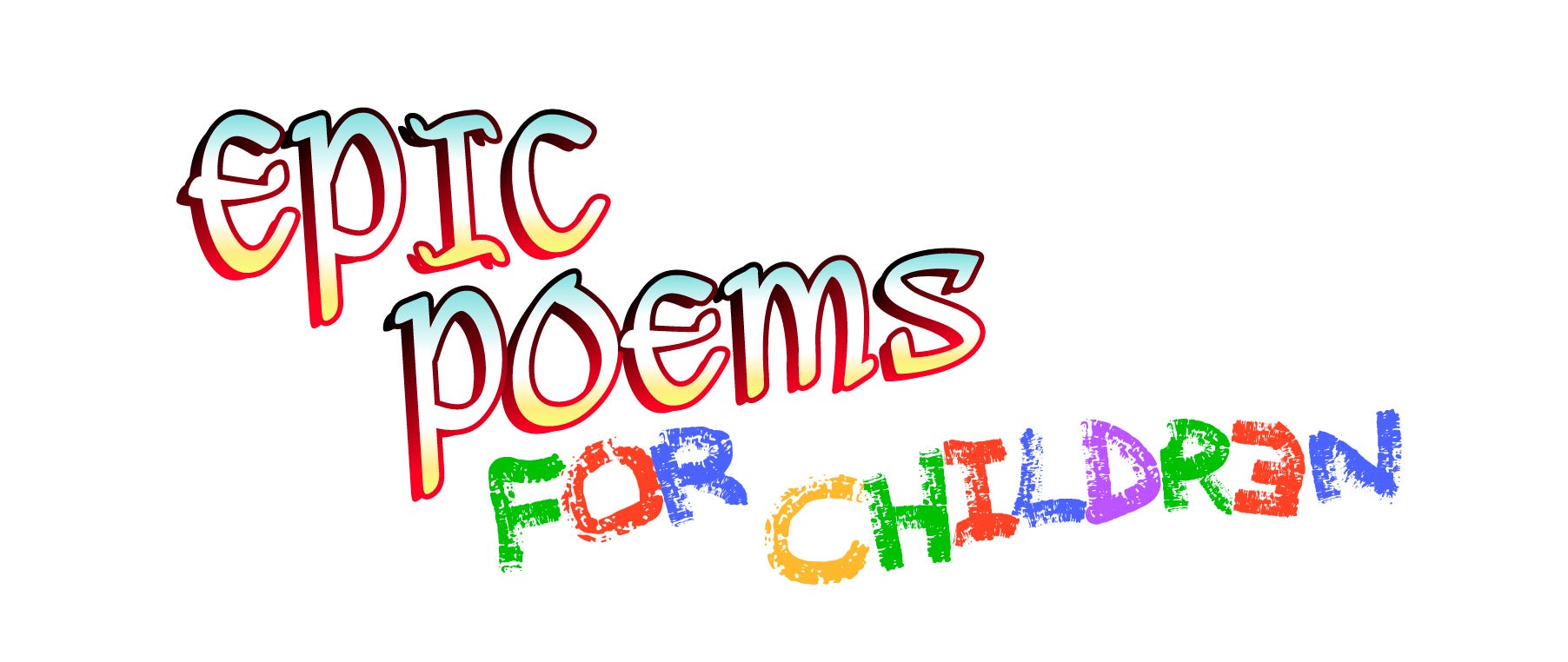
BM: Leland, tell us a bit about the logo process.
Leland Bjerg: This was an easy one. The title was a juxtaposition, so I just mirrored it with the logo design. For the "Epic Poems", I used a medieval font and gradiented the bejesus out of it to match the lighting in the cavern. Cool up top and hot down low. Then the "for Children" I did with my left hand in vibrant crayon colors. Everything was done in Adobe Illustrator.
BM: When you're choosing a logo font, what's your first step?
LB: Downloading 50 new fonts that are way too over-stylized to be good for anything, then throwing them out and finding something tasteful.
BM: How did you approach the lettering for this short?
Leland Bjerg: My favorite lettering is an actual part of the art, or it does a great job of blending in. Artist/letterers like Bill Watterson, Jeff Smith, Andrew Maclean, or David Rubin produce some of my favorite lettering. Though I also am a huge fan of "pure" letterers like Aditya Bidikar and Hassan Otsmane-Elhaou, who both excel at matching the style of the artist they're lettering over. That's the level I'm aspiring for.
I've lettered Jay's work a few times now. His linework can be very soft. He uses brushes that almost resemble pencils or charcoal. I've been searching for a balloon style and SFX that sit nicely in his art, and I thought this story was a great opportunity to experiment. I tried out a few styles of SFX and balloons, and these were the winners. The hand-drawn SFX can be a bit more labor intensive, but again, solid SFX with black outlines just does not fit with Mr. Schiek's art.
BM: I noticed that you chose a specific thought balloon stroke, that is the outline, for this story. What was your thinking there to deviate from a standard thought balloon?
LB: I think a solid black stroke from a vector program just does not fit with Jeremiah's art. I liked the look of the "ragged" balloons Steve Wands did for Gideon Falls. I thought I'd try out my own spin on something like them, which I achieved by applying a rough white brushstroke.

I thought they looked much more at home with the art, the rest of the team agreed, so we went with them. There's already a couple spots I'd like to go back to and tweak, but isn't that always the case? :)
BM: Absolutely, Leland. Something I like to remind myself is that “Perfect is the enemy of good.” I believe Voltaire said that who was quoting an Italian Proverb, but don’t quote me on it. Jokes aside, I absolutely love reimagining mythology stories, so this short and anthology are both right up my alley.
Dear readers, be sure to check out CONTAINMENT BREACH, VOLUME 2: MYTH REBORN to read this terrific troop’s comic Epic Poems for Children at the button below and follow J.L. Collins, J. Paul Schiek, Marisa Brignole, and Leland Bjerg to stay in the loop about their future collaborations and creations.